介紹 DWT 範本之前, 再次複習基本技巧
請點數位學習的開始上課然後點左邊以下這篇 (我故意不弄連結)
0327 W06站在巨人的肩膀上
0327 W06站在巨人的肩膀上
神奇的 <DIV> 和 <SPAN> 標籤(Tag)
這兩者的差別, 在於div是區塊級(block-level)元素, span是行內級(inline-level)元素,
<div>標籤會產生一個區塊,而這個區塊若沒有指定長寬,高度就會是內容物的高度,而寬度就是會涵蓋整個網頁的寬度,且與其他標籤間會自動換列(斷行)。 AP Div 就是帶有絕對位置(AP; Absolute Position)的Div區塊。
<p>標籤會表示一個段落, 每個段落當然也會自動換列。
<span>標籤本身不會自動斷行, 它所佔的區域就是內容物的高度及長度, 但是你也可以指定寬度及高度和加上block令其產生<div>的效果。
不過要注意的是不要把<div>放在<span>...</span>裡面, 雖然網頁仍可以執行,但這並不符合W3C所制定的標準。
通常一個 <div> 內會有許多 <P>, 然後一個 <P> 內可以有許多<span>的小段。
** 請注意, HTML 的標籤(Tag, 標記)是沒有大小寫區分的, 所以 <DIV> 和 <div> 沒差啦 !
| dreamweavercs5.5_20110916.doc |
請不要把 DreamWeaver 的 DWT Template(範本) 與之前的 Free CSS Template (版型)搞混
請不要把 DreamWeaver 的 DWT Template(範本) 與之前的 Free CSS Template (版型)搞混
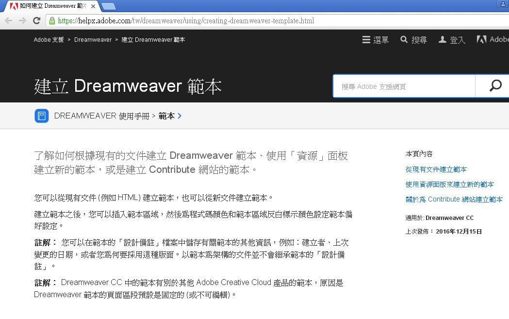
建立DreamWeaver 範本 .dwt 檔案
https://helpx.adobe.com/tw/dreamweaver/using/creating-dreamweaver-template.html
https://helpx.adobe.com/tw/dreamweaver/using/creating-dreamweaver-template.html
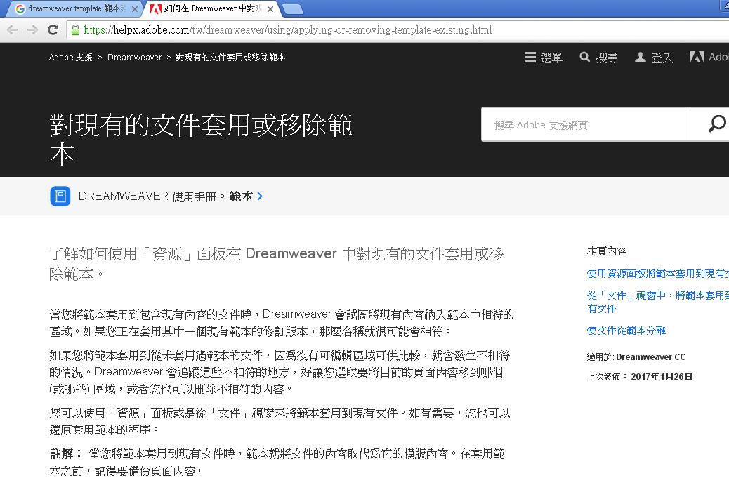
對現有的文件套用或移除範本
https://helpx.adobe.com/tw/dreamweaver/using/applying-or-removing-template-existing.html
https://helpx.adobe.com/tw/dreamweaver/using/applying-or-removing-template-existing.html
<!--------------- APDIV Sample------------------------>
<!DOCTYPE html PUBLIC "-//W3C//DTD XHTML 1.0 Transitional//EN" "http://www.w3.org/TR/xhtml1/DTD/xhtml1-transitional.dtd">
<html xmlns="http://www.w3.org/1999/xhtml">
<head>
<meta http-equiv="Content-Type" content="text/html; charset=utf-8" />
<title>神奇的 AP Div</title>
<style type="text/css">
#apDiv1 {
	position: absolute;
	width: 200px;
	height: 115px;
	z-index: 1;
	left: 55px;
	top: 33px;
}
#apDiv2 {
	position: absolute;
	width: 102px;
	height: 101px;
	z-index: 2;
	left: 353px;
	top: 356px;
	font-size: 58pt;
	-webkit-transition: all 2s ease 0s;
	-moz-transition: all 2s ease 0s;
	-ms-transition: all 2s ease 0s;
	-o-transition: all 2s ease 0s;
	transition: all 2s ease 0s;
	transform: rotate(15deg);
	background-color: #FF66FF;
}

#apDiv2:hover {
	background-color: #00F;
    color: #FFF;
	transform: rotate(-45deg);
}
#apDiv2:active {
	-webkit-transform: 1;
	-moz-transform: 1;
	-ms-transform: 1;
	-o-transform: 1;
	transform: rotate(-1068deg);
    color: #00F;
	background-color: #0F0;
	-webkit-transition: transform 12s ease 0s;
	-moz-transition: -moz-transform 12s ease 0s;
	-ms-transition: transform 12s ease 0s;
	-o-transition: transform 12s ease 0s;
	transition: transform 12s ease 0s;
}
#apDiv3 {
	position: absolute;
	width: 102px;
	height: 101px;
	z-index: 2;
	left: 239px;
	top: 169px;
	font-size: 58pt;
	-webkit-transition: transform 3s linear 0s;
	-moz-transition: -moz-transform 3s linear 0s;
	-ms-transition: transform 3s linear 0s;
	-o-transition: transform 3s linear 0s;
	transition: transform 3s linear 0s;
	transform: rotate(-30deg);
	background-color: #33FFFF;
}
#apDiv4 {
	position: absolute;
	width: 102px;
	height: 101px;
	z-index: 2;
	left: 80px;
	top: 258px;
	font-size: 58pt;
	-webkit-transition: transform 5s ease 0s 0.85;
	-moz-transition: transform 5s ease 0s;
	-ms-transition: transform 5s ease 0s;
	-o-transition: transform 5s ease 0s;
	transition: transform 5s ease 0s;
	transform: rotate(15deg);
	background-color: #FF00CC;
	color: #2A00FF;
	visibility: visible;
	filter: Shadow(Color=red, Direction=left);
}
#apDiv5 {
	position: absolute;
	width: 102px;
	height: 101px;
	z-index: 2;
	left: 488px;
	top: 356px;
	font-size: 58pt;
	-webkit-transition: all 6s ease 0s;
	-moz-transition: all 6s ease 0s;
	-ms-transition: all 6s ease 0s;
	-o-transition: all 6s ease 0s;
	transform: rotate(30deg);
	background-color: #00FF00;
	transition: all 6s ease 0s;
}
#apDiv6 {
	position: absolute;
	width: 102px;
	height: 101px;
	z-index: 2;
	left: 641px;
	top: 275px;
    color: blue;
	font-size: 58pt;
	-webkit-transition: all 2s ease 0s;
	-moz-transition: all 2s ease 0s;
	-ms-transition: all 2s ease 0s;
	-o-transition: all 2s ease 0s;
	transition: all 2s ease 0s;
	transform: rotate(15deg);
	background-color: #AABFFF;
}


body {
	background-color: #FF0;
}
#apDiv4:hover {
   transform: translateY(-58px)  scale(0.8,1.8);
   color: green;
}


#apDiv5:hover {
   left: 888px;
   top: 168px;

	-webkit-transform: rotate(2400deg);
	-moz-transform: rotate(2400deg);
	-ms-transform: rotate(2400deg);
	-o-transform: rotate(2400deg);
	transform: rotate(2400deg);
}
#apDiv3:hover {
	-webkit-transform: rotate(-360deg);
	-moz-transform: rotate(-360deg);
	-ms-transform: rotate(-360deg);
	-o-transform: rotate(-360deg);
	transform: rotate(-360deg);
}

#apDiv6 {
	-webkit-animation: rotation 3s infinite linear;
    -moz-animation: rotation 3s infinite linear;
    -ms-animation: rotation 3s infinite linear;
    -o-animation: rotation 3s infinite linear;
    animation: rotation 3s infinite linear;
}
@-webkit-keyframes rotation{
    from {-webkit-transform: rotate(0deg);transform: rotate(0deg);}
    to   {-webkit-transform: rotate(360deg);transform: rotate(360deg);}
}
@keyframes rotation{
    from {-webkit-transform: rotate(0deg);transform: rotate(0deg);}
    to   {-webkit-transform: rotate(360deg);transform: rotate(360deg);}
}

#apDiv6:hover {
   animation: rotation 0s infinite linear;
   background-color: #FFFF00;
   color: #00FF00;
}

#apDiv6:active {
	-webkit-animation: scale 6s  ;
    -moz-animation: scale 6s  ;
   transform:  scale(0.8,3.3)  rotate(-15deg);;
   color: #f00;
}

#apDiv6:target {
   background-color: #00FF00;
}
</style>
</head>

<body>
<div id="apDiv2">多</div>
<div align="center" id="apDiv4">育</div>
<div id="apDiv5">mgd</div>

<div id="apDiv6">系</div>
<div align="center" id="apDiv3">達</div>
<div id="apDiv5">遊</div>

</body>
</html>
多
育
mgd
系
達
遊
哈
